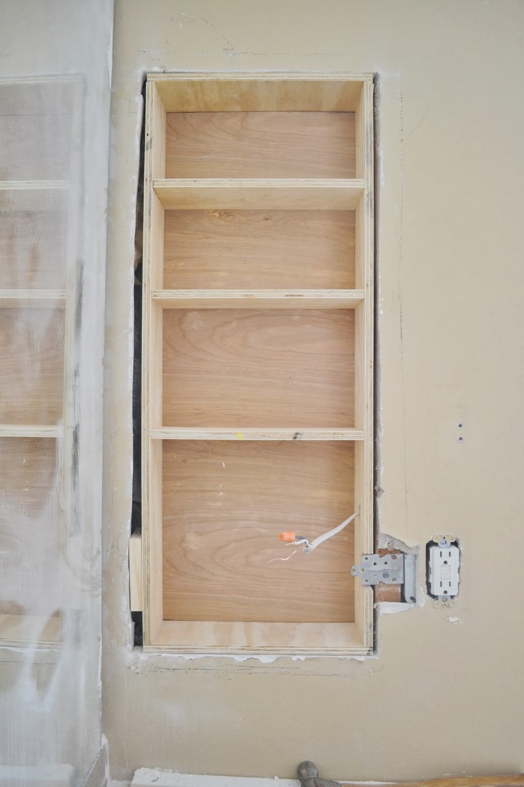
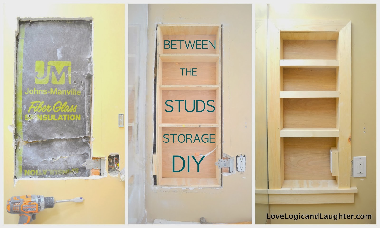
Our vanity sits between two walls. It is not a large vanity for a master bath, but we really don’t need more than what we have. I wanted some extra storage on the wall, but didn’t want it to take up too much space or stick out too far. So a between the studs storage unit seemed exactly what we needed.
This is what we had: two glass shelves mounted on the wall. They worked well, but they impeded on space by sticking out into the room.
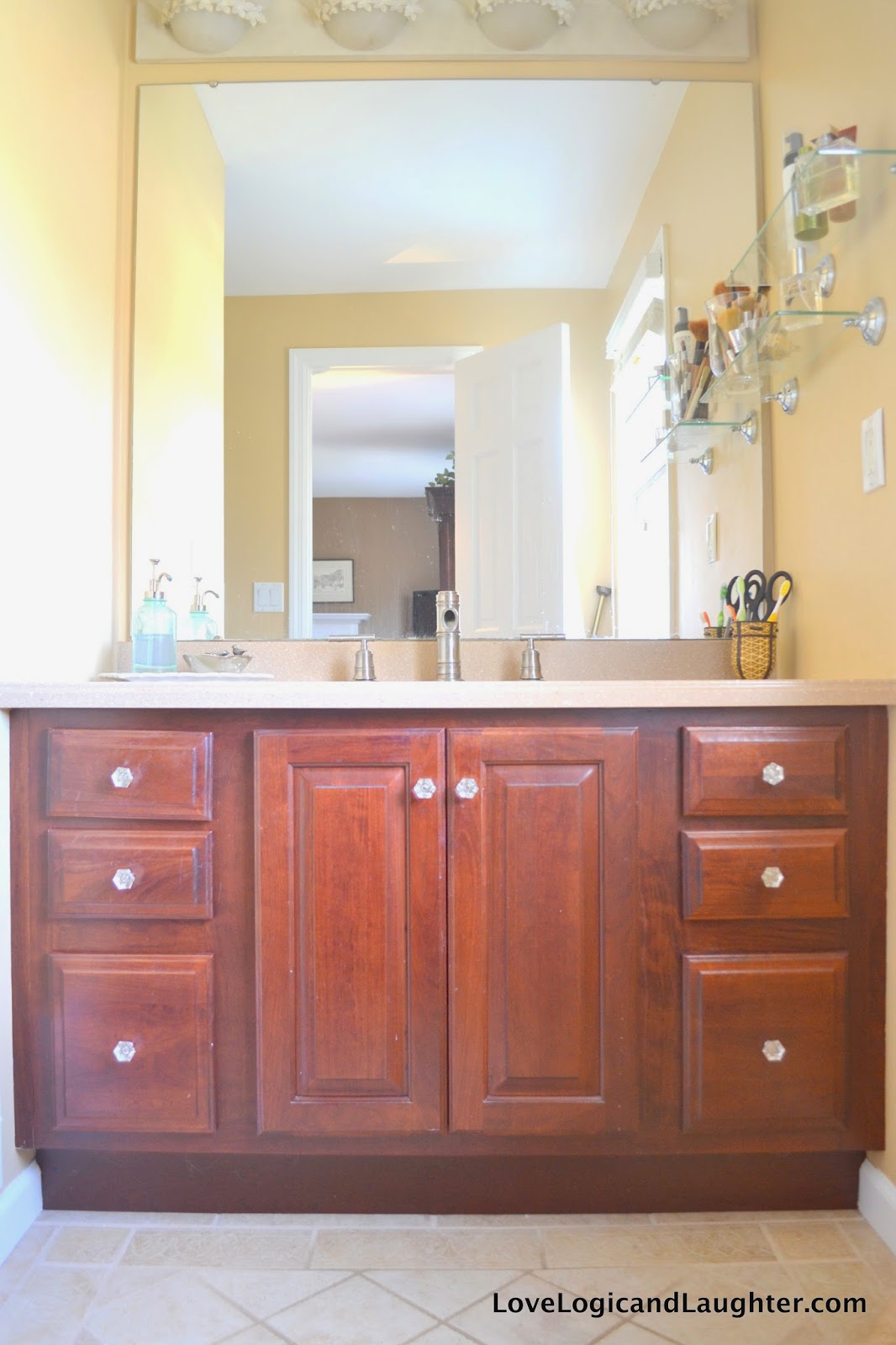
I have been looking at “between the studs” storage for awhile and think it is a great use of space. I still haven’t decided if I love it, but I think that is more a matter of me tweaking the trim work I put on it rather than the storage unit itself….at least I hope so because I don’t want to regret it all together and put the drywall and shelves back up!
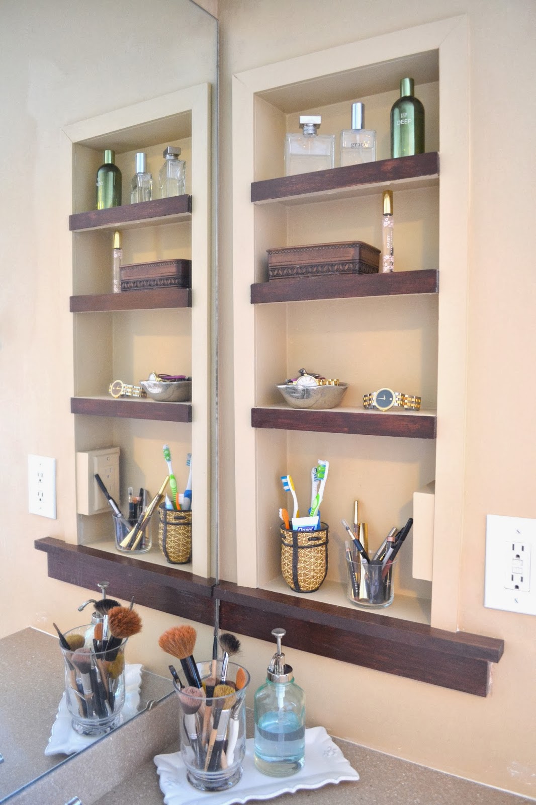
Here it is now finished and in use: It looks like there are two built-ins because of the mirror.
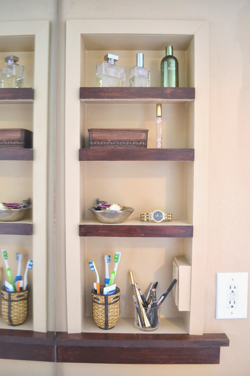
What do you think? I haven’t fallen in love with it yet. I am hoping it is a matter of tweaking the trim work that is surrounding it and not the unit itself…
What do you think it needs? I have already played with the trim work and can’t figure out how I want it.
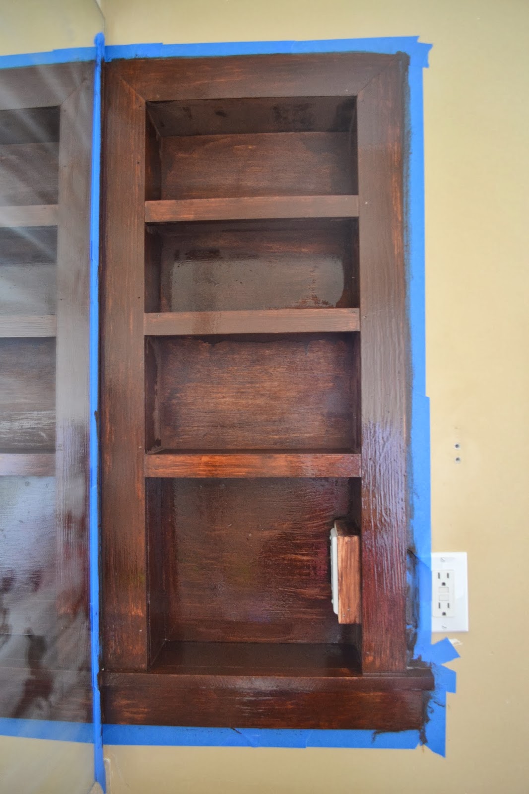
Example #1: I first stained the entire unit – big mistake – it looked like a big brown blob in the room. In this picture it it doesn’t look half bad, but when you walked in the bathroom it was the first place yours eyes (maybe just my eyes) went – I felt like it stuck out like a sore thumb. Maybe because in the mirror (which is straight ahead when you walk in) makes it look twice as big.
Example #2: I painted it white (the whole thing). And then quickly realized I didn’t like that either and started stripping it before I took a real photo of it all white. I probably made my decision too quickly here. I wish I would have left the outside trim white and painted the inside the color of the walls before I started stripping, just to see what it would have looked like. Because now I am wondering…
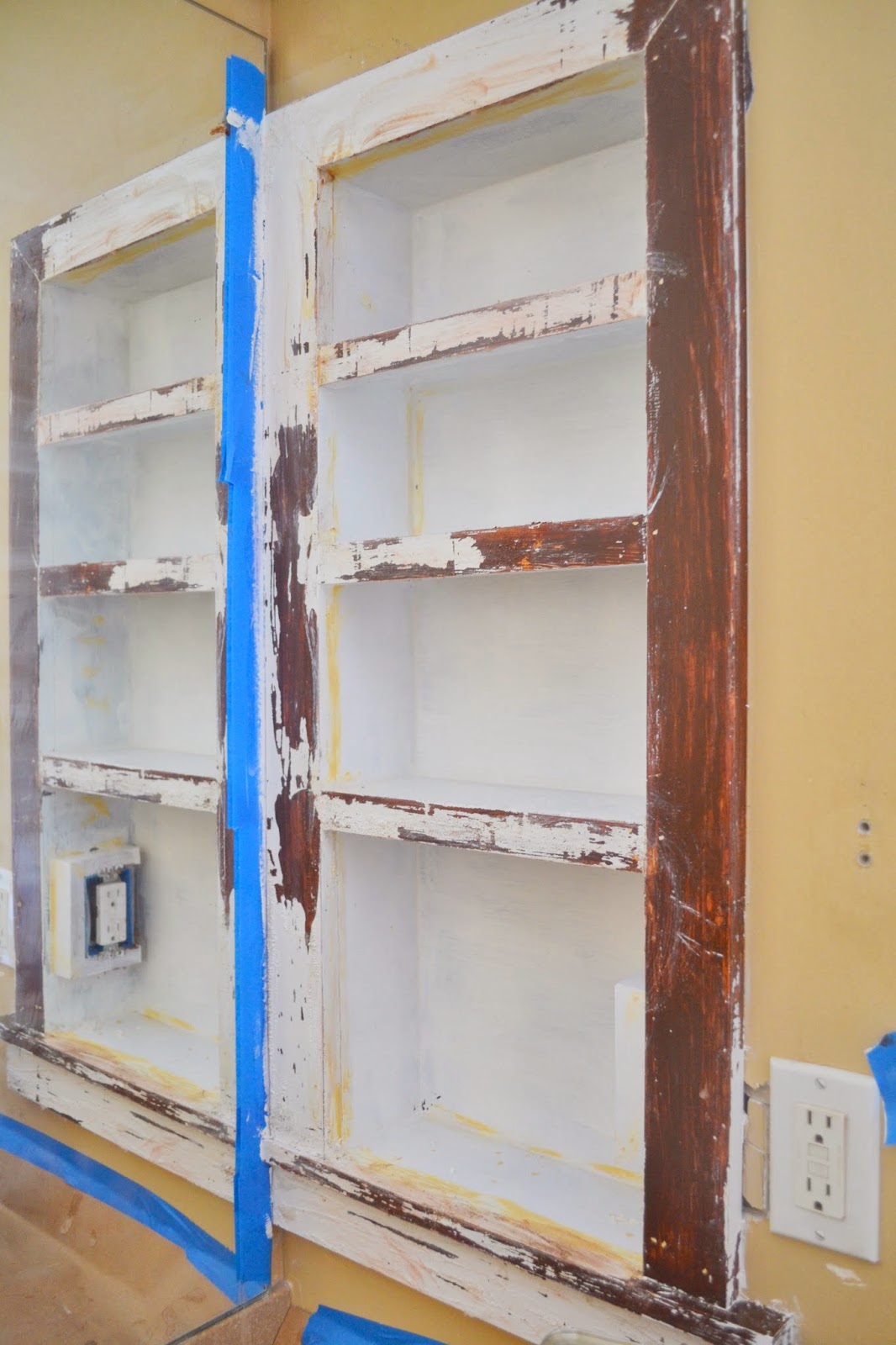
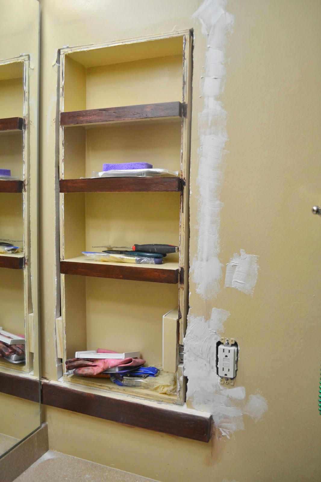
Example #3: I realized I liked other built-ins when they blended in more with the surrounding with a little pop of color in the trim (white or stain). So I painted the entire inside the same color as the walls and decided to do something else with the trim. So I ripped off most of the trim and started over…
Current: I replaced the side trim with smaller pieces and painted them the color of the walls so that the unit would almost disappear into the wall.
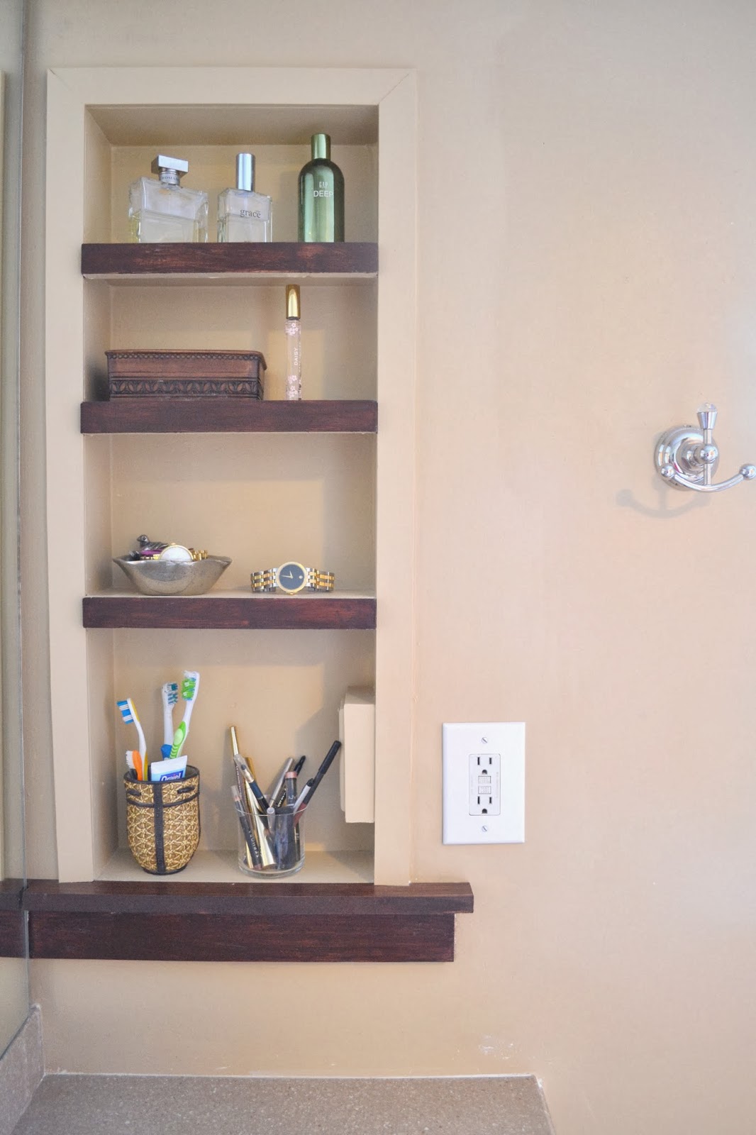
I still don’t know if I love it… 🙁
#4: An option I haven’t tried yet: Paint the trim work white and leave the inside painted the wall color. or stain the trim around the sides the same color as the shelves and leave only the inside painted the wall color.
My Inspirations (+ many more on Pinterest):
Inspiration A: diyhomepin.com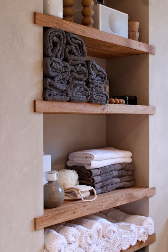 I liked how these shelves float and are not too bulky lookingInspiration B: bhg.com
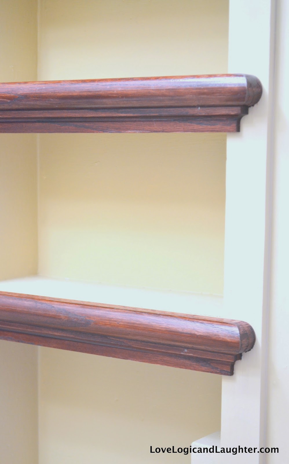
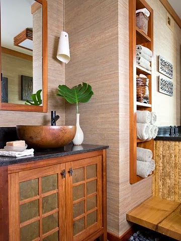 I liked how the shelves coordinate with the other wood elements in the roomInspiration C: manditremayne.blogspot.com
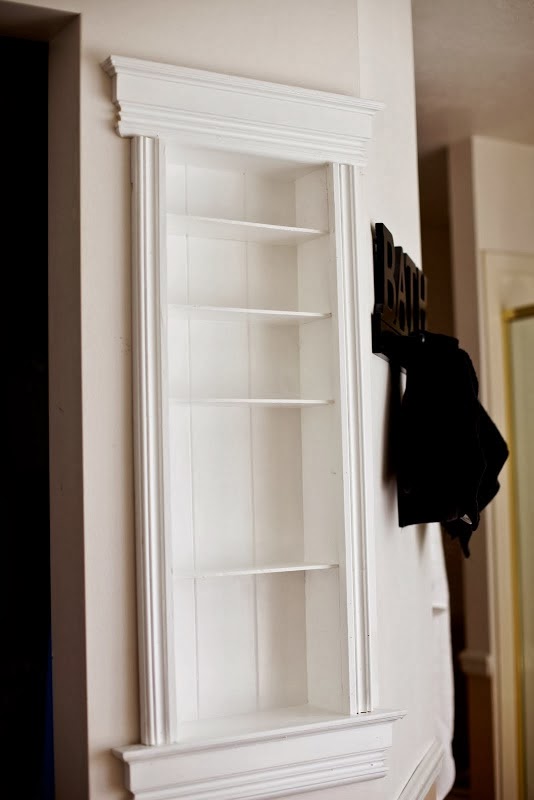 I liked the trim on this and how it is bright white along with the spacing of the shelves Inspiration D: awesomehomepins.com
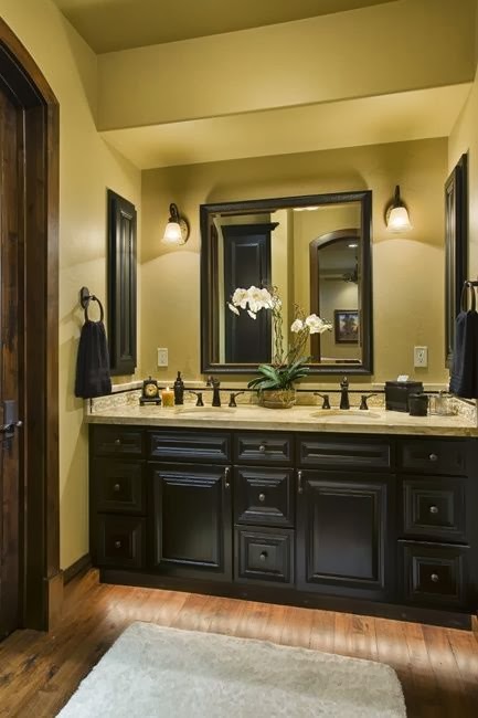 I like how the wall units coordinated with the cabinet below (I also have a wood cabinet below)
I have several more “Bathroom” inspirations pinned on Pinterest: Check them out here – I like all the images for different reasons.
So what should I do? Help and suggestions are appreciated! How can I make myself love this unit? What does it need?
I would HATE realizing that it was a mistake and taking it out and replacing it with drywall/shelves again. Mostly because of the work it would take – I despise repairing drywall – it is so hard to make it look perfect again…
I would suggest youbstain the entire shelves not just their fronts – it looks disjointed now which might be what’s bugging you. If you have white trim elsewhere in the bathroom then match the trim around this feature as well. That’ll carry consistency.
Something that will improve the entire look, IMHO, is to pull out the 2-way outlet you have installed on the inside of the shelving unit and replace the original 2-way outlet in the wall with a 4-way. (Replace the entire right side of the shelving unit too; no patches.) Apart from the 2-way outlet looking like an add-on, the plugs you will eventually plug into the 2-way in the shelving unit, and their wires will protrude laterally across the bottom shelf another 2-4 inches adding to a cluttered, added-on look. This will be amplified if you also have wires plugged into the existing wall mounted 2-way outlet. While your at it, drop the entire outlet below the lower molding of the shelf and move the 4-way to the left side of the stud. All wires (from permanently plugged in appliances) are then “contained” on the counter top and you could have the toothbrush on the lower shelf or counter top with wire neatly zip-tied with 4″- 6″ run to the outlet.
Lastly, consider 1/4″ glass shelves to lighten the look and to tie in the existing sheet glass mirror. Then molding or no molding is the question! Depending on the rest of the room/house, consider 1″ bull-nose or 90 degree drywall finish, sans molding.
I loved it when I first saw your final result. With each change you made, I said, no. And I’m not saying it just because you did all that work. Your final result is absolutely beautiful!
My master had a medicine cabinet where your built ins are. It wasn’t recessed, so I took it out. The problem is, I really miss the mirror that was hinged so you could swing it out and see the back of your head. I’m going to recess some shelves using your tutorial and cover it with another mirrored door. It might be helpful for you, since you seem to be not totally happy with your finishes. Thanks for the help.
I have a question…my shelves will be on an exterior wall. I plan to use some of that solid insulation planks behind the box. Would that work?
Wow! You certainly have worked hard and it shows. I commend you on your perseverance. I agree with two of the commenters. I like the brown on the shelves but would do the entire shelf and not just the fronts. This may help too with what you’re seeing as far as the trim goes. The second thing I agree with is the outlet. Moving it would be a good idea. If you aren’t comfortable doing that, have someone else, preferably licensed, do it.
But one thing I noticed in your inspiration photos and your bathroom photos is that in the inspiration rooms there is no mirror as close to the shelves as yours is in your room. Maybe if you cut down your mirror, width-wise, you won’t get a mirror image of the shelves as in your last inspiration photo. Just my two cents.
Again, bravo!! You have done a lot of very nice work. You can be proud no matter what your final project looks like. Well done!